Plotting Matplotlib Stock History
I guess you have seen them a thousand times: small images that show changes in value or circulation in some stock exchange.
It is typically pretty small, has a curve that looks sinusoidal with a horizontal line for starting value and a soft gray grid in the background.
An large example could be:
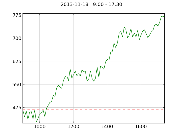
I made an example in with python and matplotlib.
import matplotlib.pyplot as plt
from random import randint
from math import sin

xvalues = range(900, 1750, 10)
yvalues = list()

(k1, k2, k3) = (randint(0, 30), randint(10, 20), randint(10, 41))

for x in xvalues:
    y = - k1*sin(0.01*x) + k2*sin(0.005*x) - k3*sin(0.02*x) + \
        x*0.37 + randint(0, 40) + 100
    yvalues.append(y)

fig = plt.figure()
ax = fig.add_subplot(111)

plt.grid(True, 'both', 'both', linestyle='-', color='0.75')
ax.plot(xvalues, [yvalues[0]] * len(yvalues), 'r--')
ax.plot(xvalues, yvalues, 'g-')
ax.get_xaxis().set_ticks(range(1000, 1601, 200))
ax.get_yaxis().set_ticks(range(100, 1001, 75))
plt.ylim(min(yvalues)*0.99, max(yvalues)*1.01)
plt.xlim(min(xvalues), max(xvalues))

#fig.set_size_inches(2, 1.3)
#plt.xticks(fontsize=7)
#plt.yticks(fontsize=7)
fig.suptitle("2013-11-18   9:00 - 17:30")
fig.set_size_inches(6.4, 4.8)
#fig.suptitle("2013-11-18   9:00 - 17:30", fontsize=7)

fig.savefig('matplotlib-2013-11-18.png')
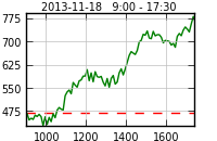
By setting a smaller font size and figure size we end up with something like this:
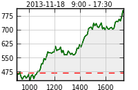
Some modifications of the script can be used to instead fill the plot.
ax.fill([xvalues[0]] + xvalues + [xvalues[-1]], [0] + yvalues + [0], '#eeeeee')
ax.plot(xvalues, yvalues, 'g-')
Other awesome graphics that you could learn a lot from mimicking are available at the Economist: [1]
Update: XKCD Stock Plot
After manually installing the xkcd additions to matplotlib I managed to get a nice and quirky look of the plot. I followed the instructions at [2] to get the newer matplotlib version into Ubuntu 12.04 (I am just a few weeks before the new LTS - perhaps matplotlib contains the xkcd there). I had to do a lot of trial and error and install dependencies manually - it takes a good reading of the logs. Other hints are:
- On why the xkcd mode is good for showing that the plot is not the importand part of, for example, a blog post: [3]
- Official Documentation: [4]
- XKCD: [5]
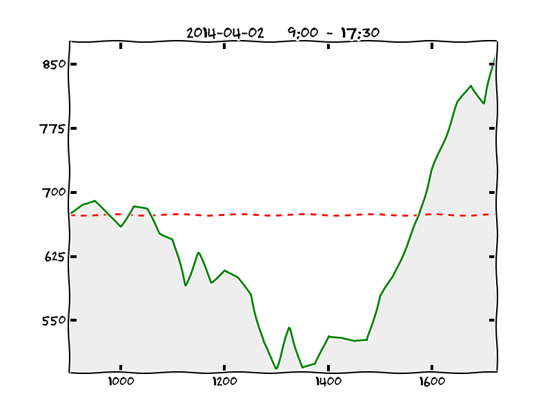
The slightly modified and very confused (I still don't really get when I have to use plt, fig and ax - I have to look that up):
import matplotlib.pyplot as plt
from random import randint
from math import sin, cos

xvalues = range(900, 1750, 25)
yvalues = list()

(k1, k2, k3) = (randint(10, 30), randint(20, 60), randint(160, 199))
(q1, q2, q3) = (randint(10, 30), randint(20, 60), randint(160, 199))

for x in xvalues:
    y = - k1*sin(0.02*x+q1) + k2*sin(0.006*x+q2) - k3*cos(0.007*x+q3) + \
        x*0.37 + randint(10, 90) + 100
    yvalues.append(y)

plt.xkcd()
fig = plt.figure()
ax = fig.add_subplot(1, 1, 1)

ax.get_xaxis().set_ticks(range(1000, 1601, 200))
ax.get_yaxis().set_ticks(range(100, 1001, 75))
ax.set_ylim(min(yvalues)*0.99, max(yvalues)*1.01)
ax.set_xlim(min(xvalues), max(xvalues))

plt.plot(xvalues, [yvalues[0]] * len(yvalues), 'r--')

plt.fill([xvalues[0]] + xvalues + [xvalues[-1]], [0] + yvalues + [0],
         '#eeeeee')
plt.plot(xvalues, yvalues, 'g-')

plt.title("2014-04-02   9:00 - 17:30")
plt.show()

fig.savefig('matplotlib-stock.png')
See also Python And Matplotlib
This page belongs in Kategori Plot