Plotting With Gnuplot
Background
Following the example in Python And Matplotlib I'd like to recall some of the techniques I used in one of my final thesises. One of the more surprising results was illustrated with an image plotted with gnuplot, included in a latex-file and compiled into a pdf. A screen shot from the report is here:
First attempt
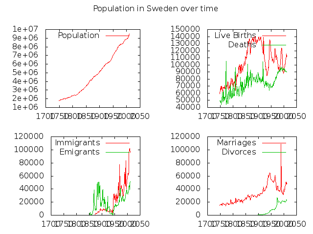
As with the Python And Matplotlib attempt I'd like to make a multiplot image. Given some trial and error I quickly managed to create a first dump using very simple gnuplot code:
set terminal png
set output "population_in_sweden.png"

set multiplot layout 2, 2 title "Population in Sweden over time"

plot "immigration.dat" using 1:2 with lines title 'Population'

plot "immigration.dat" using 1:3 with lines title 'Live Births', \
     "immigration.dat" using 1:4 with lines title 'Deaths'

plot "immigration.dat" using 1:5 with lines title 'Immigrants', \
     "immigration.dat" using 1:6 with lines title 'Emigrants'

plot "immigration.dat" using 1:7 with lines title 'Marriages', \
     "immigration.dat" using 1:8 with lines title 'Divorces'
The output is not very sexy and a bit pixly:
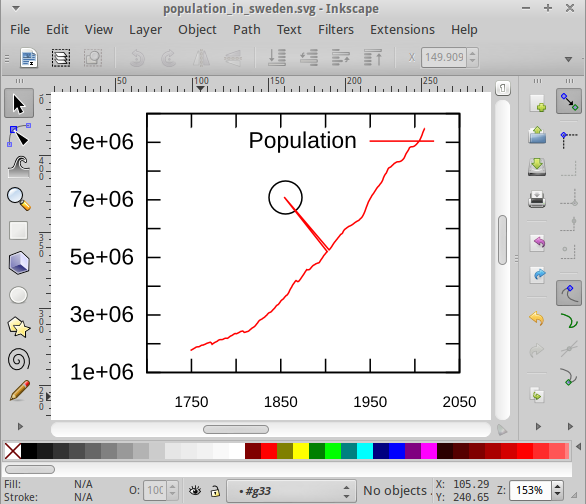
Other formats
Exporting to svg instead of png will, however, allow you to edit the plot in applications like inkscape:
Positioning the plot and some tweaks
It turns out a few hacks are needed to position the plots - this seems less intuitive that for matplotlib, but perhaps slightly more powerful. For me this now caused problems when I changed the terminal from png to pdf, ps or svg. The proportion of the fonts vs the plot layout and even the relative size of the plots got all modified. I guess this has to do with me hardcoding the sizes.
set terminal png small
set output "population_in_sweden.png"

set multiplot title "Population in Sweden over time"

set origin 0.0, 0.5
set size 1.0, 0.4
plot "immigration.dat" using 1:2 with lines title 'Population'

set origin 0.0, 0.0
set size 0.33, 0.45
plot "immigration.dat" using 1:3 with lines title 'Live Births', \
     "immigration.dat" using 1:4 with lines title 'Deaths'

set origin 0.34, 0.0
set size 0.33, 0.45
plot "immigration.dat" using 1:5 with lines title 'Immigrants', \
     "immigration.dat" using 1:6 with lines title 'Emigrants'

set origin 0.67, 0.0
set size 0.33, 0.45
plot "immigration.dat" using 1:7 with lines title 'Marriages', \
     "immigration.dat" using 1:8 with lines title 'Divorces'

unset multiplot
Some tweaks:
- set autoscale fix
- set terminal png small - smaller font
- set mxtics 5 - more tics
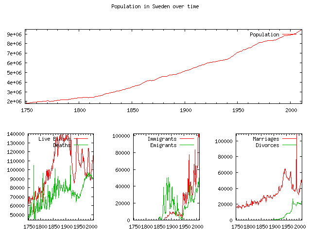
For me this is not as visually appealing as the plot we got (more or less) out of the box in Python And Matplotlib - but I know that gnuplot is very configurable.
This page belongs in Kategori Plot
This page belongs in Kategori Programmering
See also Python And Matplotlib